Responsive Design Best Practices: Making Your Website Mobile-Friendly
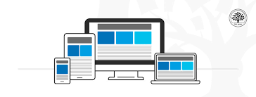
Flawless Performance on Every Screen In a digital world that lives on mobile devices, a website is only as good as its responsiveness. With 2 years of experience specializing in the Hello Elementor framework, I ensure that every pixel is perfectly placed, whether your audience is viewing from a 27-inch desktop or a 6-inch smartphone. My development process goes beyond just “shrinking” elements; I architect layouts that adapt intelligently to provide a seamless user experience on any device.
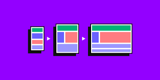
By utilizing advanced CSS Grid and Flexbox techniques within Elementor, I eliminate the frustration of broken layouts and unreadable text. For a Digital Marketer, responsive design isn’t just a feature—it is a critical requirement for SEO ranking and user retention.
Search engines like Google now prioritize mobile-first indexing, meaning your site’s mobile health determines your visibility. As a Developer and Content Writer, I focus on high-performance optimization to ensure your site loads instantly and remains intuitive. This includes optimizing touchpoints, refining typography for readability on small screens, and ensuring that your Call to Action (CTA) is always front and center.
I don’t just build websites; I build flexible digital assets that scale with your business. By merging technical precision with a marketing-first mindset, I ensure your brand remains professional, accessible, and ready to convert visitors—no matter how they choose to browse.

On the Specificity of Selectors
In today’s digital landscape, a website is only as effective as its responsiveness. As a Web Developer with 2 years of experience, I specialize in building flexible layouts that adapt beautifully to any screen size. Whether your users are browsing on a high-definition desktop or a handheld smartphone, I ensure the transition is seamless. Using the Hello Elementor framework, I prioritize mobile-first development to ensure your site is fast, accessible, and user-friendly from the moment it loads.
Responsive design is more than just “shrinking” content; it’s about rethinking the User Interface (UI) to maintain clarity and functionality. By leveraging modern CSS techniques and grid layouts, I eliminate the need for zooming or horizontal scrolling, keeping your Digital Marketing goals at the forefront by making sure your call-to-action is always easy to findent.