
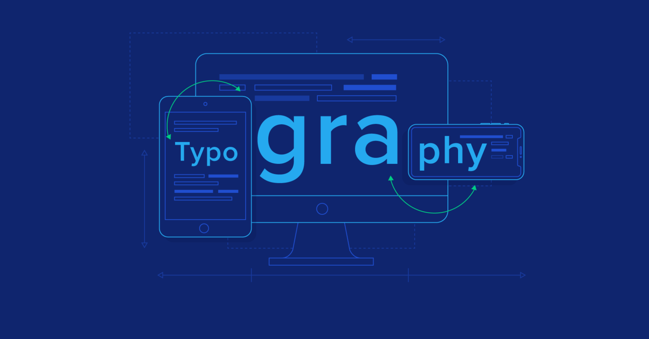
Typography in Web Design: Choosing Fonts That Make an Impact
LWhy Typography is the “Secret Sauce” of Web Design
In web development, many focus solely on code or imagery, but 90% of the web is text. As a Web Developer and Digital Marketer, I’ve seen how the wrong font can increase bounce rates, while the right typography can drive conversions.
Typography isn’t just about picking a “pretty” font; it’s about Readability, Accessibility, and Brand Authority.elit nisi irure reprehenderit ut et dolor labore veniam quis.
Section 1: Building with Purpose Great web development is about more than just writing code; it’s about creating a seamless experience that guides the user toward a goal. With 2 years of experience in the industry, I have dedicated myself to mastering the balance between technical precision and creative strategy. Every project I undertake is built on a foundation of clean code and user-centric design, ensuring that your digital presence is both powerful and professional.
I specialize in using the Hello Elementor framework to build high-performance websites that are optimized for speed and scalability. By focusing on the details—from mobile responsiveness to intuitive navigation—I help brands establish a digital footprint that truly reflects their values and mission.

On the Specificity of Selectors
Since you’re moving away from placeholder text to build your professional brand as Nabeel, it’s time to replace this Latin with content that highlights your expertise in Typography and Web Design.
Here is the “Normal English” version for this section, tailored for your portfolio:
The Power of Typography in Modern Web Design
Headline: Why Font Choice is the Backbone of User Experience
Typography is far more than just picking a font; it is the art of arranging text to make it legible, readable, and appealing when displayed. In my 2 years of experience as a Web Developer, I have seen how the right typography can transform a basic website into a professional brand. Using the Hello Elementor framework, I prioritize font pairings that balance aesthetic beauty with high-speed performance.
When we talk about impact, we are talking about Visual Hierarchy. By using different weights, sizes, and spacing, I guide the user’s eye to the most important information first—your call to action. Whether it’s a bold sans-serif for a modern tech vibe or a classic serif for a trustworthy legal site, the goal is always to enhance the Digital Marketing strategy through design.